Back in 2011, I was working on a bootstrapped startup. That's when I really started to learn about optimising conversion.
There were two big changes affecting designers at the time.
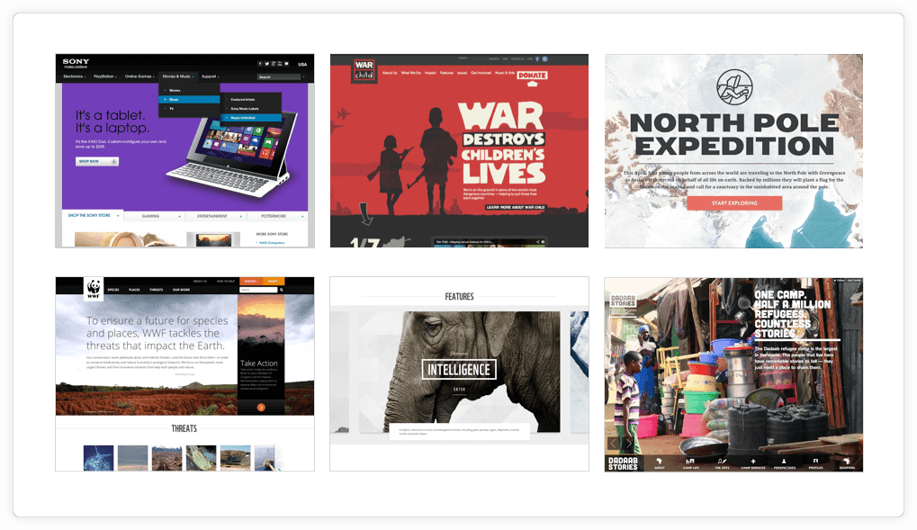
The first change was the ability to use web fonts. It’s hard to remember now, but ten years ago most of the Internet used “web safe” fonts that would load from the end user’s device.
Pages were quick to load, but much of the web lacked the creative expression and personality it has today.
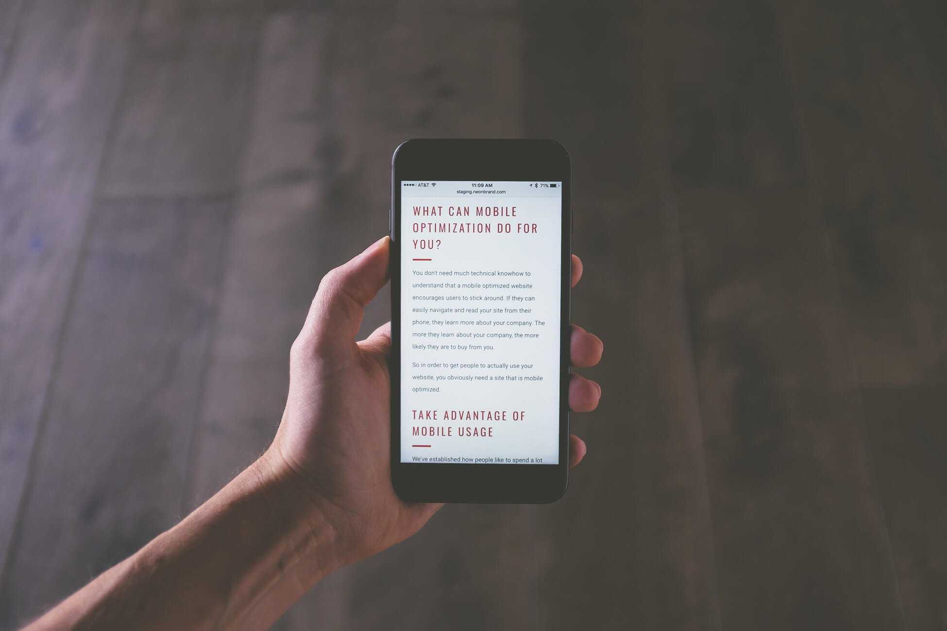
The second change was the huge increase in mobile. This fuelled the rise of responsive design as a way to deliver better experiences whatever the device.

Building better tools
As a team, we were really excited about these changes. We could see how they would make the web a better environment for consuming content.
We wanted the designers and developers shaping that environment to be equipped with better tools. To help them make the web more beautiful, and more readable.
Our natural drive was to pour all our energy into building a great product.
We thought the changes we could see around web fonts and responsive design were obvious and inevitable, and everyone would naturally want better tools.

We found the leaks in our funnel by talking to users
If I thought about marketing, it was about how we’d fill the top of the funnel and build awareness. Or making sure we lived up to our promises when customers used the product.
But as a bootstrapped startup, we didn’t have the luxury of building a large funnel by pouring more traffic in with large scale ad budgets.
So we had to find ways to get more of the people who were visiting our website to become customers.
At first, we weren’t sure where to start. But we had enough self awareness to realise we didn’t know everything. And enough drive to make a great product that that we were willing to talk to our users every week.
We learned which parts of our story resonated and which were confusing. We started to uncover the anxieties and uncertainties that were holding potential users back from converting.
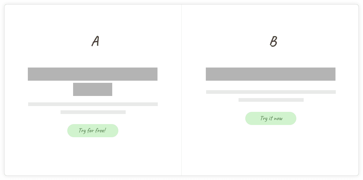
Each week, we would take insights from those conversations and quickly sketch out changes to our website and onboarding journey. To get past our personal preferences, we used Visual Website Optimizer to run tests and look for statistically significant improvements to our conversion rate.

Compound interest: the eighth wonder of the world
Not every idea would be an improvement. The changes that helped, we kept. And even in the tests that failed, we came away with a better understanding of what our customers really wanted from us.
But as the weeks went by, our conversion rate - and our customer numbers - went up. And up. And up.
What I didn’t understand, at first, was how much impact we could have by focusing on whether those top of the funnel visitors eventually signed up and became customers.
Winning tests built on the improvements that came before. The results compounded. And more signups meant more advocates for our product, and more word of mouth.
The wonderful thing about conversion rate optimisation was that it provided a structured framework for us to better serve our customers. It helped us all bring our best selves to discussions about what those experiences should look like.
Looking back now, those experiments had the highest ROI of any marketing we ever did. The most impactful change we ever made was to re-write the headline, subcopy and button label on our homepage.

Making Websites Win.
I remember at the time reading advice from the Conversion Rate Experts blog (and, later, Chris Goward’s book - You Should Test That).
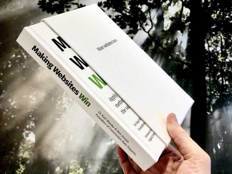
So I was very excited to see the founders of Conversion Rate Experts, Dr Karl Blanks and Ben Jesson, publish their own book: Making Websites Win.

For anyone interested in learning more, it is a great introduction on what conversion rate optimisation is, why it can make such a huge difference to your business.
It offers a ton of simple, accessible advice for anyone who wants to make their sales and marketing better and better over time. I especially like the diagnose-problem-solution model.
And now the Kindle edition is on sale at Amazon: https://amzn.to/2wg3gxu
Now it’s your turn
The lessons I took from that experience about getting more visitors to convert have stayed with me.
The benefits of the lift in conversion gave us more than just a better funnel. It helped us sharpen our story and make things clearer for our customers.
Where are the biggest leaks in your funnel? To make improvements you have to understand what’s preventing visitors from converting.
If you’re not already running regular tests, you might be worried that you don’t have enough traffic to run statistically significant tests.
Here are some quick and simple ideas to help you get started even if you don’t have a lot of traffic (and they’ll still work great when you do).
- Start testing your customer journey with real people. Ideally these will be target customers but I’ve found you can uncover problems even when the user isn’t a perfect match.
- Use screen recording tools like FullStory or HotJar to see where people are struggling to find what they’re looking for.
- Make sure you’re tracking the flow through your funnel with Google Analytics. Amplitude has a great free plan that can help you find where visitors are getting stuck. Other good analytics tools include MixPanel and Heap.
- Commit to testing changes regularly. It’s the best way to force you to learn what’s working, and you can leave behind what doesn’t.
Share your thoughts or questions with us on Twitter at @usecontinually.

